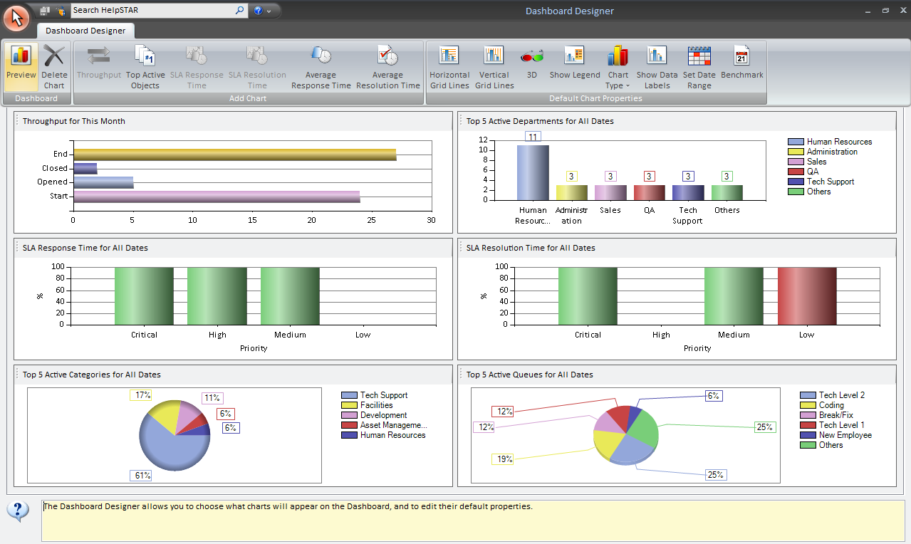
The Dashboard allows a user with the Reports Privilege to view an instant overview of your help desks performance.


Click on the white space area for the chart you wish to update. An Image will appear to the left of the chart title (shown below), and the toolbar will be updated with selectable options for that chart. All changes made in the toolbar will be for the chart that is selected.


The six charts that are shown are displayed by default and can be replaced by different charts using the Dashboard Designer.
You are able to right click on any chart to adjust the date range and change the chart presentation. You can also modify the other properties as shown below.
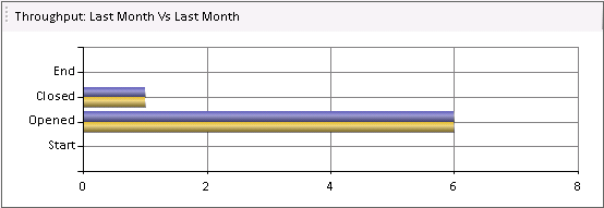
This chart represents the volume of requests passing through your help desk. It shows the number of requests… 1) open at the START of… 2) OPENED during… 3) CLOSED during… 4) open at the END of… the selected date range.
When you right-click on the chart, a form with several tabs will be displayed to let you make changes.
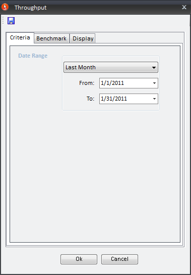
This tab allows you to adjust the date range so you are seeing only the information you need to see.
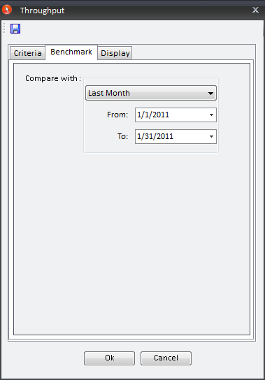
This tab allows you to enter a "Compare With" date range so you can compare it to the date range set on the Criteria tab.
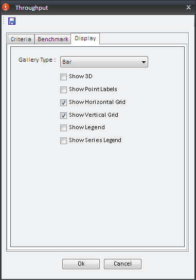
The "Display" tab allows you to change the chart presentation. You can select whether you would to have a "Bar", "Column", "Line" or "Area" chart.
You can also add the following options to this chart:
After you have selected the date ranges, and set all the options you would like to view, click "OK" to view the updated chart.

This chart shows the parent Categories that were used the most during the selected date range – i.e. the parent Categories associated with the greatest number of active (not closed) requests (including requests in sub-categories).
You can click on any Category sector to view a listing of all active requests associated with it, and you can double-click on any line in the listing to view a request"s details. When you right-click on the chart, a form with several tabs will be displayed to let you make changes.
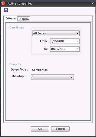
This tab allows you to adjust the date range so you are seeing only the information you need to see.
The "Group By" section allows you to view what object type which is being displayed. The "Show Top" section allows you to select the number of top categories you would like to display.
Note: If you have the Dashboard Designer, you can add similar charts that group active requests by the top Support Reps, Parent Queue Folders, Organizational Units and Companies.
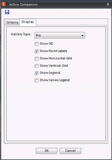
The "Display" tab allows you to change the chart presentation. You can select whether you would to have a "Bar", "Column", "Line", "Area" or "Pie" chart.
You can also add the following options to this chart:
After you have set all the options you would like to view, click "OK" to view the updated chart.
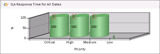
This chart shows the ratio (in %) of requests that meet/exceed the Service Level Agreement. Both active and closed requests are included, and they are grouped by their current priority.
You can click on each priority bar to view a density graph showing the distribution of response times for request with that priority (shown below).
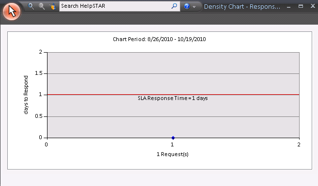
The red line between the two gray sections indicates the maximum Response Time allowed in order for requests to meet the Service Level Agreement. Requests above the line exceed the Response SLA set for that priority level (only an administrator can Configure the Service Level Agreement). Hovering over a point will display the title of the request, while clicking on a point will display the request details.
Note: If the density graph displays many requests, they may be so close together that they form a solid line. To expand your view of the requests you can click the zoom –in button in the toolbar. Then click on the chart and drag the cursor to select the area you wish to magnify. To zoom back out to your original view you can click the toolbar button again.
When you right-click on the chart, a form with several tabs will be displayed to let you make changes.
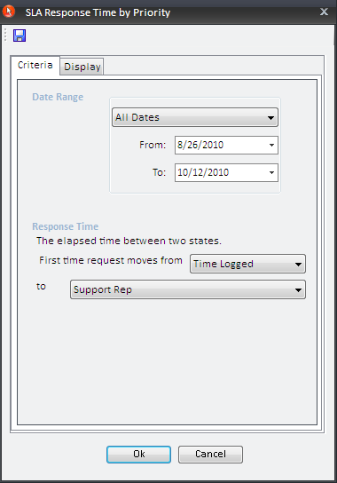
This tab allows you to adjust the date range so you are seeing only the information you need to see.
Also, you are able to configure the Response Time setting – i.e. to choose the specific state transition that will constitute a request response. Your help desk's response time for each request will be the elapsed time between the two states you select. You can choose from any of the combinations shown below, except "Queue to Queue" and "Support Rep to Support Rep".
![]()
(An administrator may configure a system-wide Response Time setting from his System Options, but your local setting will override the system-wide configuration.)
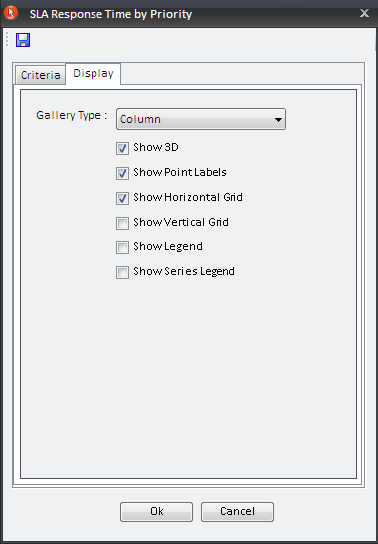
The "Display" tab allows you to change the chart presentation. You can select whether you would to have a "Bar", "Column", "Line", "Area" or "Pie" chart.
You can also add the following options to this chart:
After you have set all the options you would like to view, click "OK" to view the updated chart.

This chart shows the ratio (in %) of requests that met/exceeded the Service Level Agreement (see SLA section in System Options) when they were closed. The requests are grouped by their current priority.
You can click on each priority bar to view a density graph showing the distribution of response times for request with that priority (shown below).
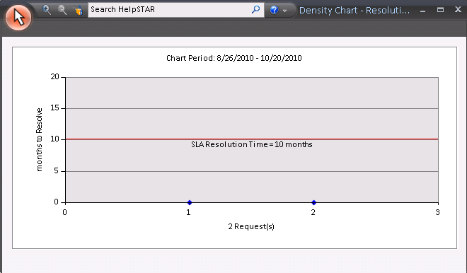
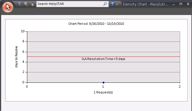
The red line between the two gray sections indicates the maximum Response Time allowed in order for requests to meet the Service Level Agreement. Requests above the line exceed the Response SLA set for that priority level (only an administrator can Configure the Service Level Agreement). Hovering over a point will display the title of the request, while clicking on a point will display the request details.
Note: If the density graph displays many requests, they may be so close together that they form a solid line. To expand your view of the requests you can click the zoom –in button in the toolbar. Then click on the chart and drag the cursor to select the area you wish to magnify. To zoom back out to your original view you can click the toolbar button again.
When you right-click on the chart, a form with several tabs will be displayed to let you make changes to that chart.
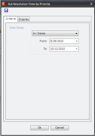
This tab allows you to adjust the date range so you are seeing only the information you need to see.
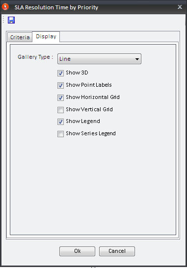
The "Display" tab allows you to change the chart presentation. You can select whether you would to have a "Bar", "Column", "Line" or "Area" chart.
You can also add the following options to this chart:
After you have selected the date ranges, and set all the options you would like to view, click "OK" to view the updated chart.

This chart shows the specific Categories or sub-categories with the highest average response times for service requests.
You can click on each Category bar to view a density graph showing the distribution of response times for requests with that Category. Hovering over a point will display the title of the request, while clicking on a point will display the request details.
When you right-click on the chart, a form with several tabs will be displayed to let you make changes.
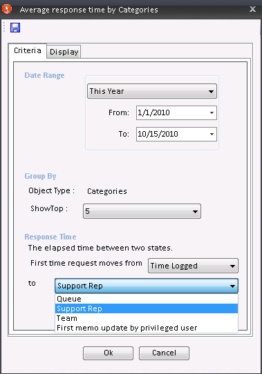
The "Date Range" section allows you to adjust the date range so you are seeing only the information you need to see.
The "Group By" section allows you to view what object type which is being displayed. The "Show Top" section allows you to select the number of top categories you would like to display.
You are able to configure the "Response Time" setting – i.e. to choose the specific state transition that will constitute a request response. Your help desk's response time for each request will be the elapsed time between the two states you select. You can choose from any of the combinations shown below, except "Queue to Queue" and "Support Rep to Support Rep".
![]()
(An administrator may configure a system-wide Response Time setting from his System Options, but your local setting will override the system-wide configuration.)
Note: The Date Range only applies to the first state specified for the Response Time. Note also that the chart shows the Categories that were current when the requests were updated to the second state.
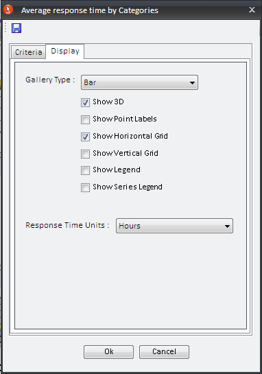
The "Display" tab allows you to change the chart presentation. You can select whether you would to have a "Bar", "Column", "Line", or "Area" chart.
You can also add the following options to this chart:
You can also modify the "Response Time Units" (hours, days or months).
Note: If you have the Dashboard Designer, you can create two similar charts that show the top Support Reps and specific queue folders with the highest average response times for service requests.
After you have set all the options you would like to view, click "OK" to view the updated chart.

This chart shows the specific Categories or sub-categories with the highest average resolution times for service requests (the requests must have been closed within the selected date range).
You can click on each Category bar to view a density graph showing the distribution of resolution times for requests with that Category. Hovering over a point will display the title of the request, while clicking on a point will display the request details.
When you right-click on the chart, a form with several tabs will be displayed to let you make changes.
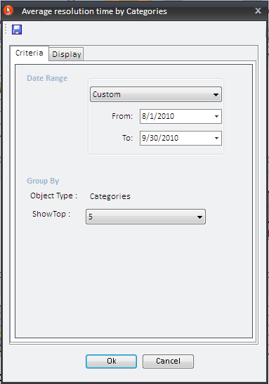
The "Date Range" section allows you to adjust the date range so you are seeing only the information you need to see.
The "Group By" section allows you to view what object type which is being displayed. The "Show Top" section allows you to select the number of top categories you would like to display.
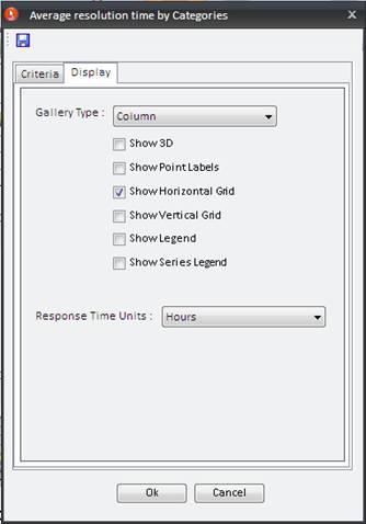
The "Display" tab allows you to change the chart presentation. You can select whether you would to have a "Bar", "Column", "Line", or "Area" chart.
You can also add the following options to this chart:
You can also modify the "Response Time Units" (hours, days or months).
Note: If you have the Dashboard Designer, you can create two similar charts that show the top Support Reps and specific Queue folders with the highest average response times for service requests.
After you have set all the options you would like to view, click "OK" to view the updated chart.
It is important to note that any changes you make to the charts in the Dashboard cannot be saved when you close the window. If you wish to modify the chart defaults then you must use the Dashboard Designer. The Designer also allows you to change the variety of charts that are displayed in the Dashboard.
Note: Unless your help desk never closes, the calculation of Response and Resolution times will be more accurate if you have configured its hours of operation. See Business Hours for more details.
See Also: