The information presented in this topic requires a thorough understanding of the Dashboard functionality.
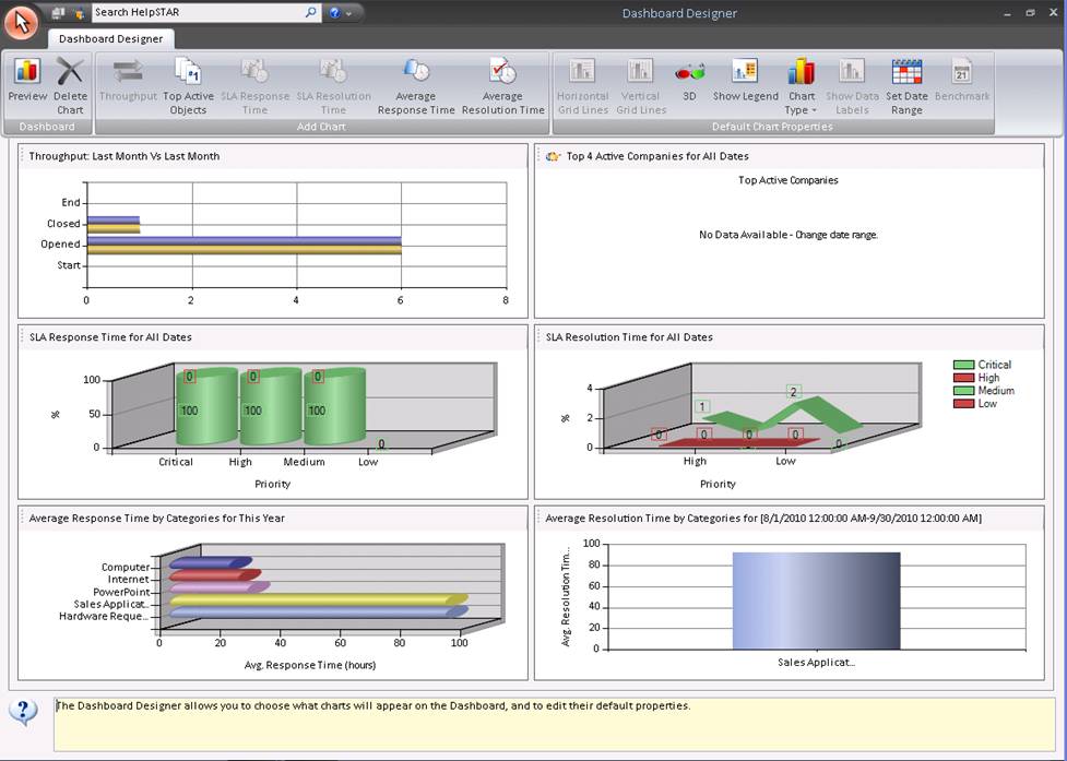
The Dashboard Designer allows you to choose what charts will appear on the Dashboard, and to edit their default properties. The Dashboard can display up to six charts, from a total of fourteen available in the Designer. You must have the Report Privilege to use the Designer.

When you first run the Designer, each chart type in the gallery area will correspond to one of six icon buttons in the Add Charts section of the ribbon toolbar, as shown above. If you delete a chart type from the gallery, this allows you to select one of the toolbar buttons to fill the empty gallery area in order to configure a new chart type. This functionality enables you to edit a variety of charts that are displayed in the Dashboard
![]()
Click on the white space area for the chart you wish to update. An Image will appear to the left of the chart title (shown below), and the toolbar will be updated with selectable options for that chart. All changes made in the toolbar will be for the chart that is selected.


This section allows you to select a chart that you wish to add to the dashboard. Note that if you already have 6 charts, you will be unable to add another chart unless you delete one. Once you have selected the button for the chart you wish to add, the properties box for that chart will appear for your customizations.
For more information on the chart properties, please see Dashboard.
Although the Designer can be used to create fourteen different chart types, both it and the Dashboard can only display a maximum of six. If there is no available position, you can create one by deleting a chart which you do not require.
Although the Designer shows just six main chart types (as represented by the buttons), several of these types permit you to create a number of different charts. While the "Throughput", "SLA Response Time" and "SLA Resolution Time" buttons allow you to create one chart each, the remaining three buttons can be used to configure separate charts for different objects, as shown below.

By default, the three chart types shown above are configured to show "Category" charts in the Dashboard, but the Dashboard Designer enables you to specify other objects that the chart data will apply to. You can configure five different charts for the "Top N Active Objects", and three different charts for each of "Average Response for…" and "Average Resolution for…". (Note that the first chart type will only show parent Categories or Queue folders, but requests in child Categories or Queue folders will be included in the calculation. The other two chart types will show specific Categories or Queue folders, which may be sub-categories or sub-queue folders.)
If a button allows you configure multiple charts, you may use it several times into separate empty gallery areas (if this is what you want). Each subsequent time you select the same button, you must select a different object that that chart type will apply to. For example, you could select the "Top N Active Objects" button five times into separate empty gallery areas and configure five different charts showing the Top N Active… parent Categories, Support Reps, parent Queue folders, Organizational Units and Companies. These would then become five of the default charts on the Dashboard.

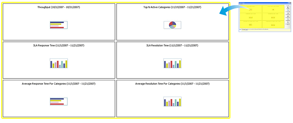
You can click on each of these chart types to change the default properties (see Dashboard for more on this) of the corresponding Dashboard charts.
In the gallery area, you can click on any chart type to change its properties. This functionality is similar to that of the Dashboard, except that when you do it in the gallery you are setting new defaults for the corresponding Dashboard chart. (Note that you cannot set a default "Benchmark" for the Throughput chart. A Benchmark comparison date can only be set from the Dashboard.)
As you make changes to a chart type in the Designer, you can preview how it will appear in the Dashboard by clicking on the "Preview" button at the top-left of the Designer window.
This chart represents the volume of requests passing through your help desk. It shows the number of requests… 1) open at the START of… 2) OPENED during… 3) CLOSED during… 4) open at the END of… the selected date range.
When you click on the chart, a form with several tabs will be displayed allowing you to make changes.
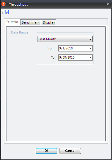
This tab allows you to adjust the date range of the requests represented in the chart.
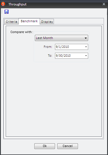
This tab allows you to enter a "Compare With" date range so you can compare it to the date range set on the Criteria tab.
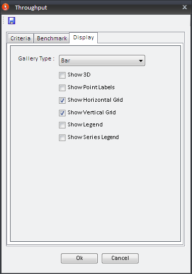
The "Display" tab allows you to change the chart presentation. You can select whether you would like to have a "Bar", "Column", "Line" or "Area" chart.
You can also add the following options to this chart:
This chart shows the top number(s) (1 – 5) of the selected object (Company, Organizational Unit, Category, Queue, or Support Rep) that were used the most during the selected date range – i.e. the Companies associated with the greatest number of active (not closed) requests. When you click on the chart, a form with several tabs will be displayed allowing you to make changes.
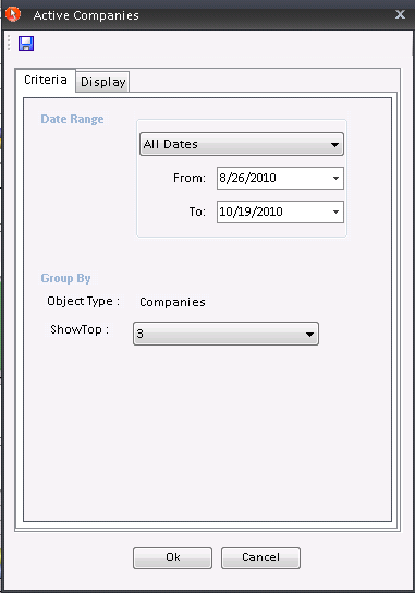
This tab allows you to adjust the date range of the requests represented in the chart.
The "Group By" section allows you to select the object type which is will be displayed (Company, Organizational Unit, Category, Queue, or Support Rep). The "Show Top" section allows you to select the number of top object you would like to display.
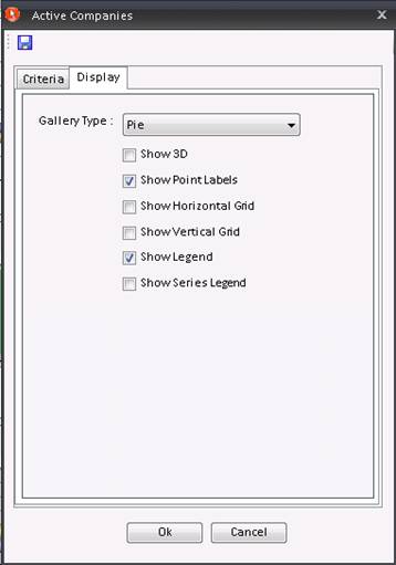
The "Display" tab allows you to change the chart presentation. You can select whether you would to have a "Bar", "Column", "Line", "Area" or "Pie" chart.
You can also add the following options to this chart:

This chart shows the ratio (in %) of requests that meet/exceed the Service Level Agreement. Both active and closed requests are included, and they are grouped by their current priority.
When you click on the chart, a form with several tabs will be displayed allowing you to make changes.
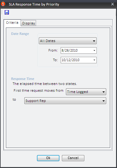
This tab allows you to adjust the date range of the requests represented in the chart.
Also, you are able to configure the Response Time setting – i.e. to choose the specific state transition that will constitute a request response. Your help desk’s response time for each request will be the elapsed time between the two states you select. You can choose from any of the combinations shown below, except "Queue to Queue" and "Support Rep to Support Rep".
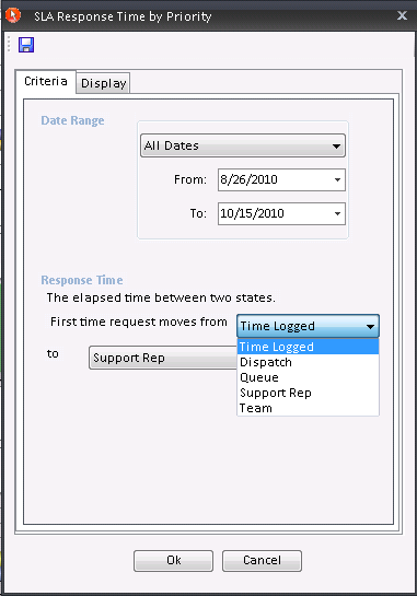
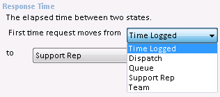
(An administrator may configure a system-wide Response Time setting from his System Options, but your local setting will override the system-wide configuration.)
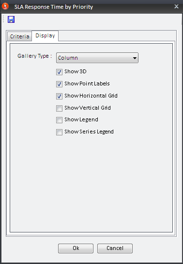
The "Display" tab allows you to change the chart presentation. You can select whether you would to have a "Bar", "Column", "Line", "Area" or "Pie" chart.
You can also add the following options to this chart:

This chart shows the ratio (in %) of requests that met/exceeded the Service Level Agreement (see SLA section in Data Analysis| when they were closed. The requests are grouped by their current priority.
When you click on the chart, a form with several tabs will be displayed allowing you to make changes.
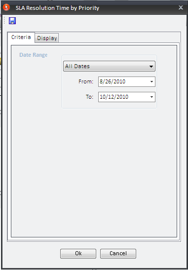
This tab allows you to adjust the date range of the requests represented in the chart.
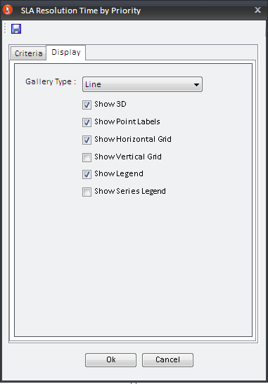
The "Display" tab allows you to change the chart presentation. You can select whether you would to have a "Bar", "Column", "Line" or "Area" chart.
You can also add the following options to this chart:
This chart shows the top specified object (Company, Organizational Unit, Category, Queue, or Support Rep) or with the highest average response times for service requests.
When you click on the chart, a form with several tabs will be displayed allowing you to make changes.
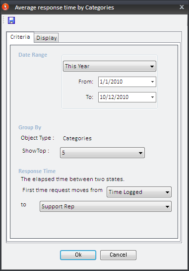
The "Date Range" section allows you to adjust the date range of the requests represented in the chart.
The "Group By" section allows you to select an object type (Company, Organizational Unit, Category, Queue, or Support Rep) that you would like to be displayed. The "Show Top" section allows you to select the number of top specified object you would like to display.
You are able to configure the "Response Time" setting – i.e. to choose the specific state transition that will constitute a request response. Your help desk’s response time for each request will be the elapsed time between the two states you select. You can choose from any of the combinations shown below, except "Queue to Queue" and "Support Rep to Support Rep".
(An administrator may configure a system-wide Response Time setting from his System Options, but your local setting will override the system-wide configuration.)
Note: The Date Range only applies to the first state specified for the Response Time. Note also that the chart shows the objects that were current when the requests were updated to the second state.
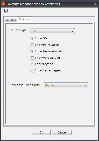
The "Display" tab allows you to change the chart presentation. You can select whether you would to have a "Bar", "Column", "Line", or "Area" chart.
You can also add the following options to this chart:
You can also modify the "Response Time Units" (hours, days or months).
This chart shows the specified objects with the highest average resolution times for service requests (the requests must have been closed within the selected date range).
When you click on the chart, a form with several tabs will be displayed allowing you to make changes.
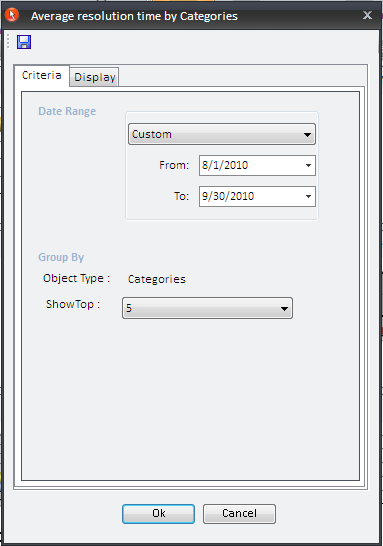
The "Date Range" section allows you to adjust the date range of the requests represented in the chart.
The "Group By" section allows you to select an object type which you would like to be displayed. The "Show Top" section allows you to select the number of top objects you would like to display.
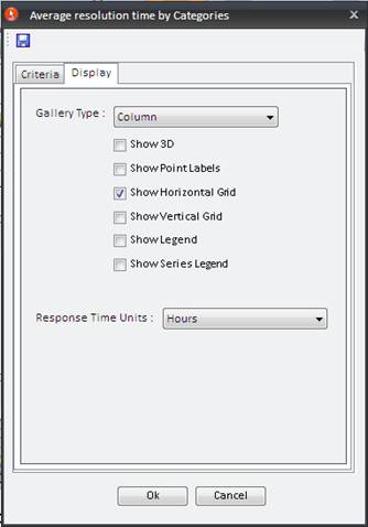
The "Display" tab allows you to change the chart presentation. You can select whether you would to have a "Bar", "Column", "Line", or "Area" chart.
You can also add the following options to this chart:
You can also modify the "Response Time Units" (hours, days or months).
Note: The SLA Response/Resolution settings for each priority level can only be modified under an administrator’s System Options. An administrator can also change the Response Time setting system-wide.
See Also: