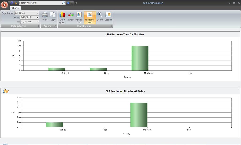
The section allows you to view a percentage of requests that have met or exceeded your organization’s Service Level Agreements (SLA).


Chart Type: Select the chart format. Options include Column, Line, Area or Bar formats.
The SLA Response Time chart shows the ratio (in %) of service request that meet/exceed the Service Level
Agreement’s Response Time as defined by your organization in your System Options. Both active and closed requests are included
and are grouped by their current priority.
By hovering over a priority grouping, you can view the ratio of requests that have met or exceeded the SLA
as shown below.

The SLA Resolution Time chart shows the ratio (in %) of service request that meet/exceed the Service Level
Agreement’s Resolution Time as defined by your organization when they have been closed. The requests
are grouped by their current priority.
By hovering over a priority grouping, you can view the ratio of requests that have met or exceeded the SLA
as shown below.

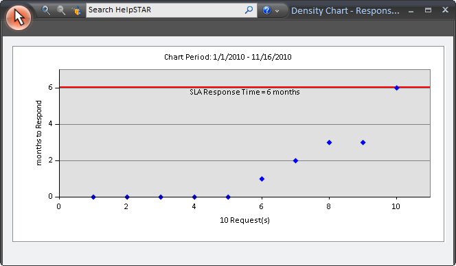
You can click on each priority bar to view a density graph showing the distribution of response times for
request with a certain priority (shown below).

The red line between the two gray sections indicates the maximum Response Time allowed in order for a
request to meet the Service Level Agreement. Requests above the line exceed the Response SLA set for that
priority level (only an administrator can Configure the Service Level Agreement). Hovering over a point will
display the title of the request, while clicking on a point will display the request details.
Note: if the density graph displays many requests, they may be so close together that they form a solid line.
To expand a view of requests:
1. Click on the Zoom Out ![]() button in the
toolbar.
button in the
toolbar.
2. Click on the chart and drag the cursor to select an area to magnify.
3. To zoom back out to your original view you can click on the Zoom In
![]() button on the toolbar.
button on the toolbar.
1. Click on the white space area for the chart you wish to
update. An Image will appear to the left of the chart ![]()
2. The toolbar will be updated with options for the selected chart. Click on an option in the Chart Display grouping to change the appearance of the chart. All changes made in the toolbar will be for the chart that is selected.
See Also: