This section allows you to generate a quick visual overview of how requests are being handled by your help desk. You can select charts by date range as well as opened or closed requests. You can group requests by Company, Organizational Unit, Priority, Category, Queue, Status or Support Rep, and Filter them by Request Count, Time In Queue, or Time In Service. There is also a chart that allows you to view request 'Throughput’ for a series of days, weeks or months.
Note: HelpSTAR charts can be run from either the Windows client or the Web Portal. You must have the Reports Privilege to generate charts.


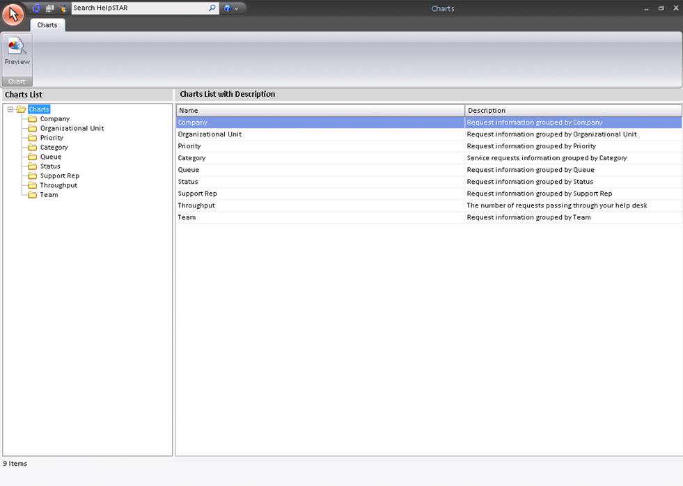
This section allows you to select which chart you would like to view. You can choose from the following:
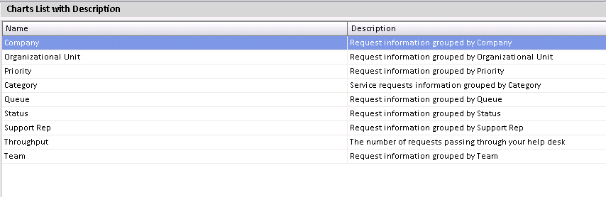
This section displays all charts that are available to view, and provides a brief description for each chart. This section also allows you to select a chart to view as shown below.
To view a chart, select a chart type and click on it. The following screen will appear (the "Throughput" Chart type is different and will be described further in detail):
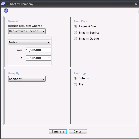
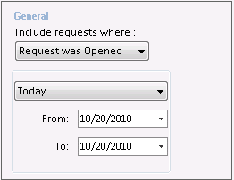
This section allows you to specify a date range for the requests you would like to view as well as specify whether to include requests that were opened during the range or closed during the range.

This section allows you to specify whether you would like to view one of the following:
Note: If you specify Time In Queue or Time In Service, requests that have not spent any time In Queue or In Service will be automatically excluded from the chart.
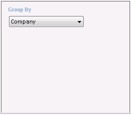
This section will allow you to select which of the following you would like to group your chart results by:
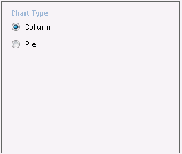
This section allows you to select whether you would like to view your chart as one of the following:
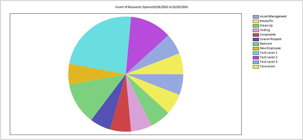
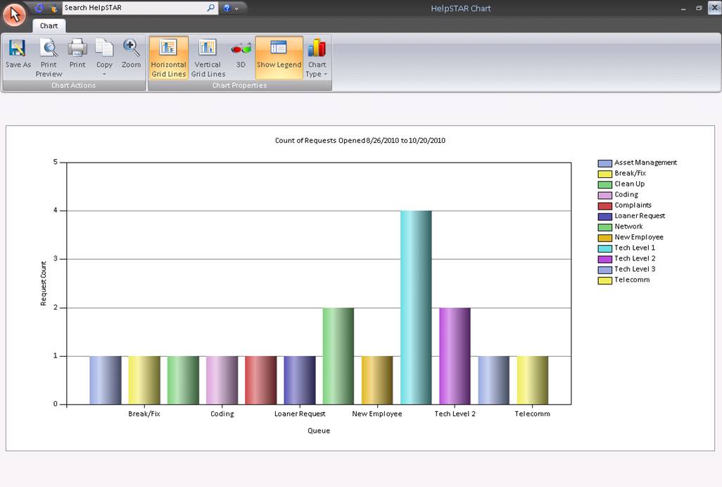
Note: After the chart is drawn, you can click the Chart Type button on the Ribbon Toolbar to select from a drop-down menu of available chart types (Bar, Pie, Line, etc.). You can also right-click on a chart to change the colors, show a legend and edit a title.
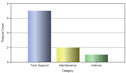
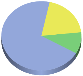
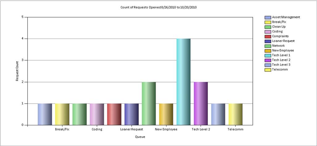
Once all properties have been selected, a HelpSTAR chart will appear in a new window as shown below:
This chart is different visual representation than the previous seven charts described. It allows you to compare the volume of requests passing through your help desk for a succession of days, weeks or months. Within the selected date range, the chart will show the number of requests…
1) OPEN at the START of…
2) OPENED during…
3) CLOSED during… each day, week or month.
When you select the Throughput chart, you will see the following window:
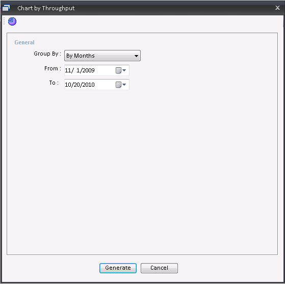
This section allows you to define whether you would like to group by the following:
You also are able to specify a date range for which you would like to view Throughput for.
See Also: